KingBoost
—
2024
Development of near game service for US and Europe
SERVICES
UX research, business analitic, UI design
Products & Deliverables
UX research, Web design

Kingboost is a service that helps players from the US and European countries to achieve more in online video games. This service provides experienced players who perform various tasks for customers, thus saving them time and sometimes money to get unique achievements or the necessary level to play video games comfortably.
My role in the project
As part of the project, I conducted research into past solutions to problems requiring attention, a large-scale competitor analysis, redesigned the old KingBoost website, improved the user journey, and developed a new brand style and user experience.
Objective
The goal of this project was to solve the main user problems in the previous solution, and to increase the conversion rate of the main user journey, as well as to improve the overall UI, which by the time of the offense to work, was, to put it mildly, outdated. Based on the overall task, it was decided to update the brand identity to match the modern design.

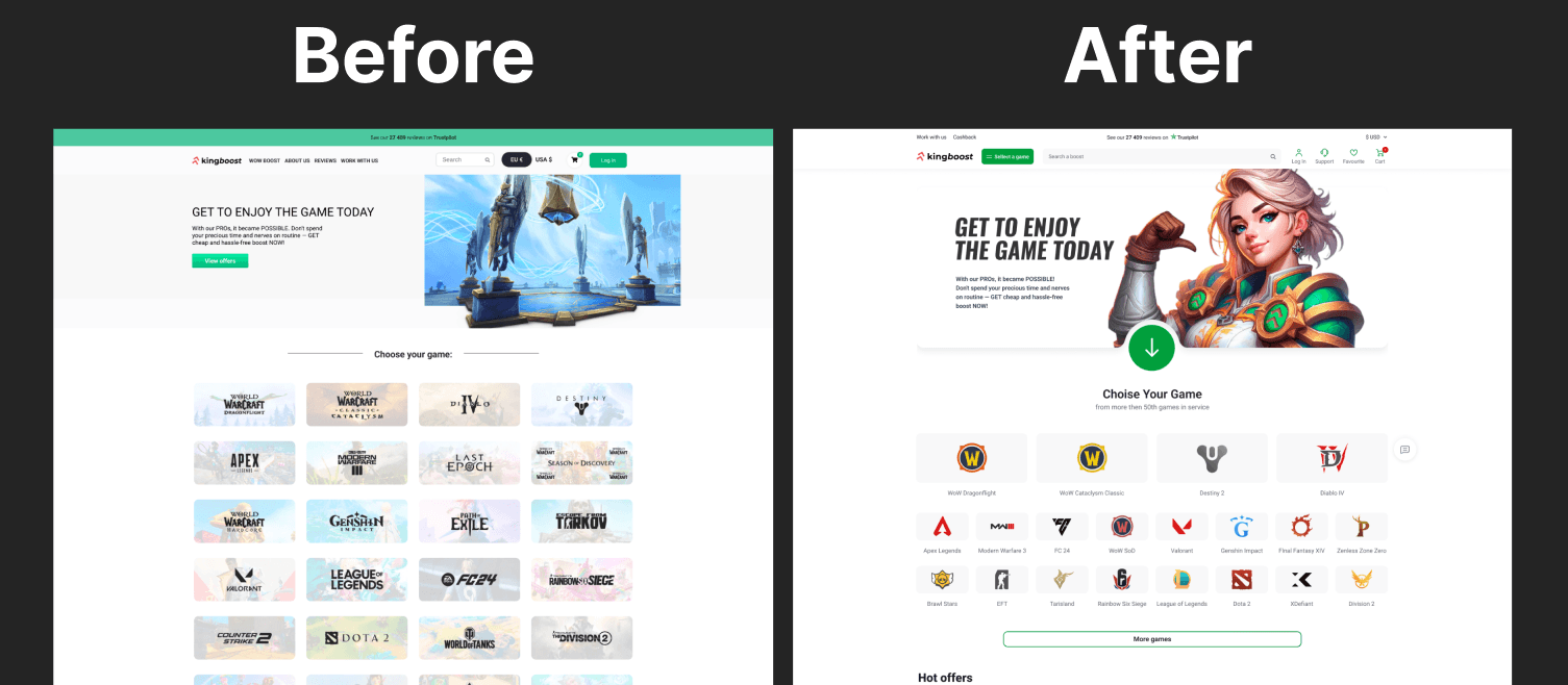
Before. The site clearly needs a redesign to meet modern standards
Research
I started my work by analyzing the current solution, identifying user pains.
After, I started analyzing competitors, how they deal with these pains and what solutions they have applied. The user journey of about 6 competitors was analyzed in detail, and more than 14 competitor sites were additionally reviewed for best practices.

Each contest was broken down in detail and the best techniques of each were identified
Ideas and concepts
After a detailed analysis, hypotheses were generated to improve the user experience. About 70 hypotheses were generated, which after validation were successfully applied in the new design.
The validation of the ideas was done through interviews with PMs, customer support and marketing department, taking into account data and experience with users.

Each white square is a different hypothesis
Visual Presentation
For the main idea of the design of this product was taken the idea of clean design with bright, eye-catching elements of brand identity. Another technique that was applied in the design of this site was realized in the selection of games (product section). The games themselves were realized in a form close to the icons of games on the desktop.
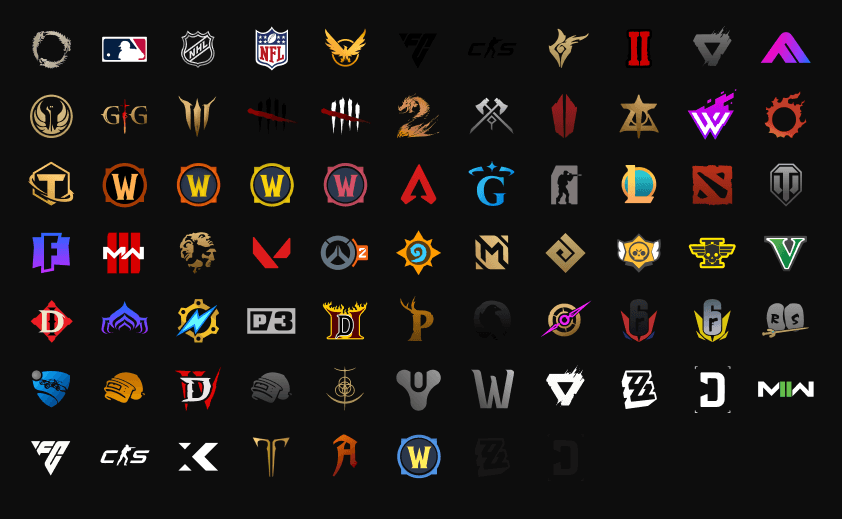
More than 50 unique vector color icons were rendered for this project

As part of the project, more than 1,400 unique images were developed with the help of AI
Major changes:
Redesigned navigation system Improved product search
Added favorites for authorized users
Games not the first popularity are hidden behind the button, to reduce visual noise
Redesigned header architecture
Due to the original icons of games significantly simplified navigation
Major changes:
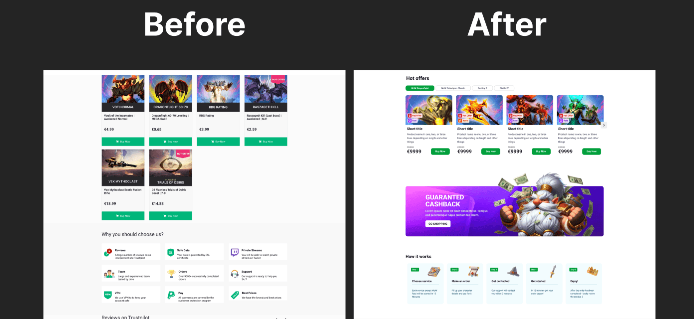
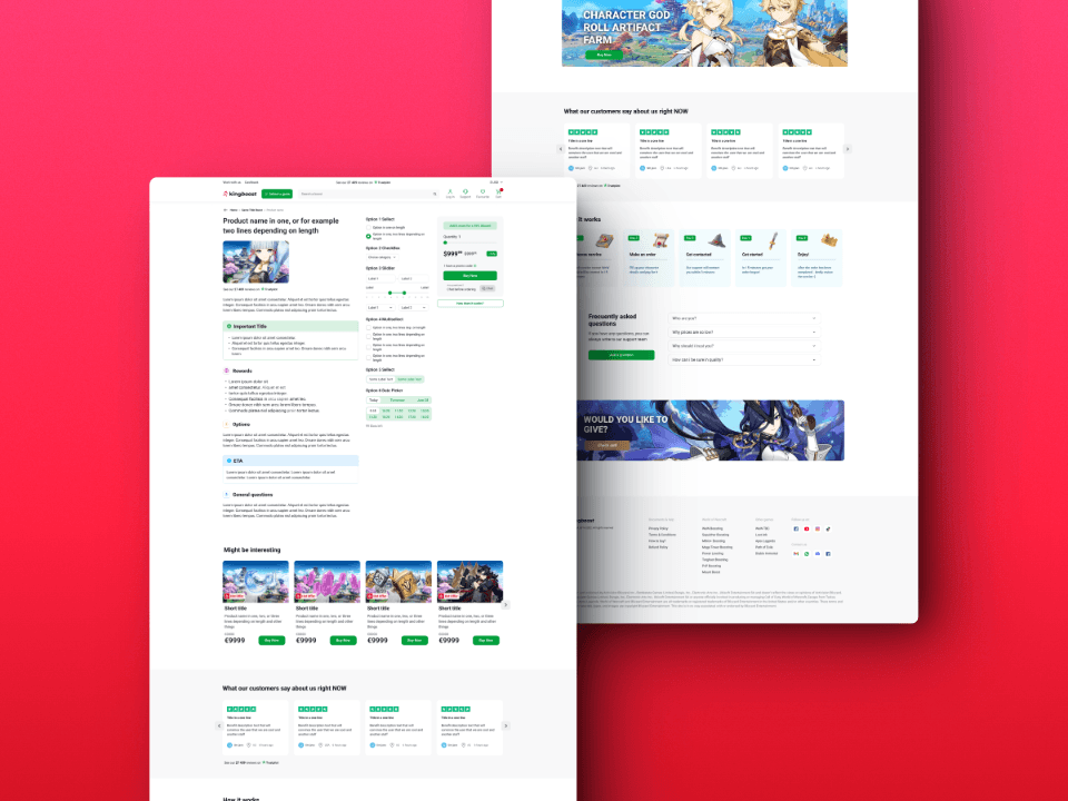
Changed the product card, which has become more informative and hierarchical
Added product tags, to simplify navigation and shorten the name
Products in the Hot Offers block are now broken down by game
Redesigned block with benefits

Major changes:
Product description has become structured
Added links to support and FAQ
Added the ability to enter a promo code on the product page
Product settings block almost always fits within the one screen
Always visible price and buy button
And much, much more
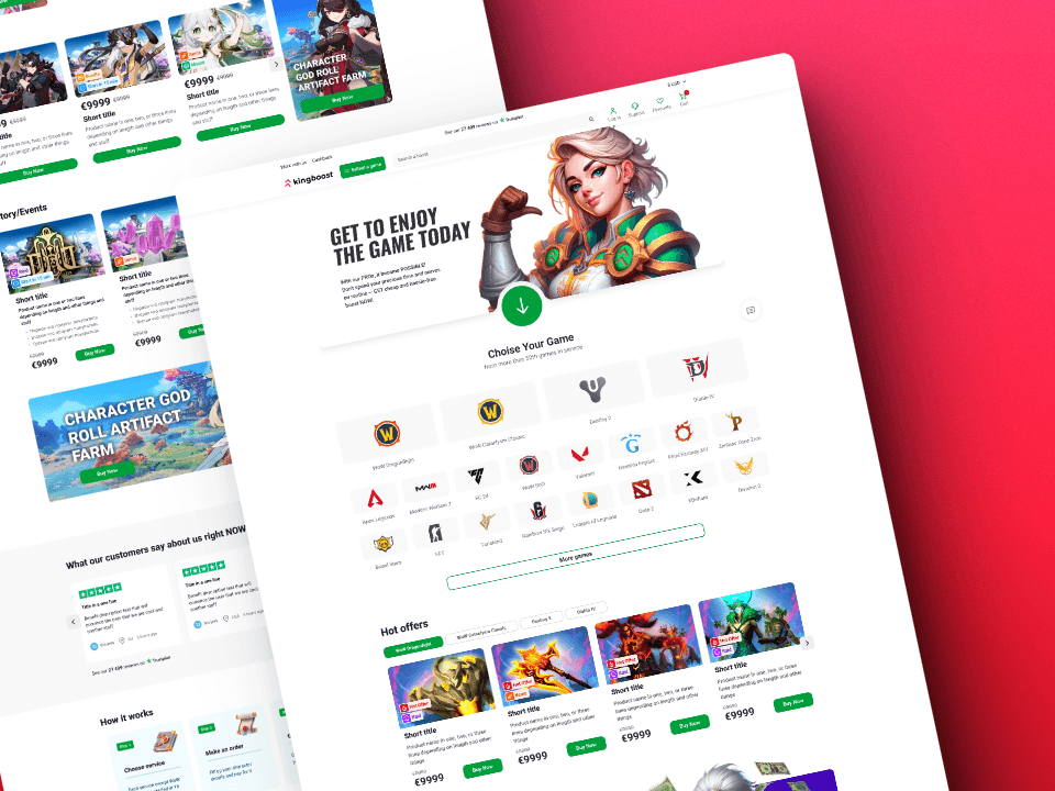
Presentation of the final result of the redesign

Conclusion
As a result, we were able to achieve the final redesign, taking into account the brand identity, best practices of competitors and significantly improve the current user flow, thus developing one of the best designs in this market segment.
Feel free to say hi, let's discuss your questions
Next project